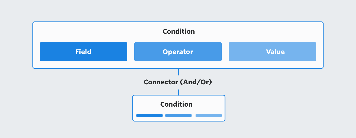
Segment Builder
When marketers want to create a targeted campaign within SendGrid, they need to define a segmented group of people from their contact lists to send the campaign to. This segmented group can be targeted based on a variety of different attributes, including demographic data, engagement with past emails, and custom attributes.
As the lead designer on this project, my role was to create a better experience for marketers to define and create segments within the SendGrid Marketing Campaigns platform. I was also responsible for ensuring that developers would be able to easily create and edit segments via the API. My goal in this project was to redesign our base query language and to create an intuitive segment builder to help marketers easily build and edit segments.
Step 1 → Problem Discovery
The primary job our segment builder was to make it easier for marketers to write Structured Query Language (SQL) queries against their contact database to build smaller segments based on rules involving event data, such as engagement with a past email, and contact field data, such as gender or language preference. Marketers typically aren’t familiar with writing SQL, so the segment builder UI was designed to help empower her to do so.
To better understand the problems our customers were experiencing with the current segment builder, I performed internal interviews with our Customer Success and Support teams, as well as external interviews with customers. From this initial round of research I was able to collect feedback on our current query language and subsequent segment builder to uncover the following pain points:
- Use of inconsistent segment terminology across the platform (including docs) caused confusion when customers were trying to self troubleshoot, or seek out help from our Support Team.
- Our current UI only supported AND logic, or OR logic, but not both together. This was a huge limitation on how complex our marketer could make her segment.
- Our current UI did not support nested conditions, so the query was limited to being one layer deep.
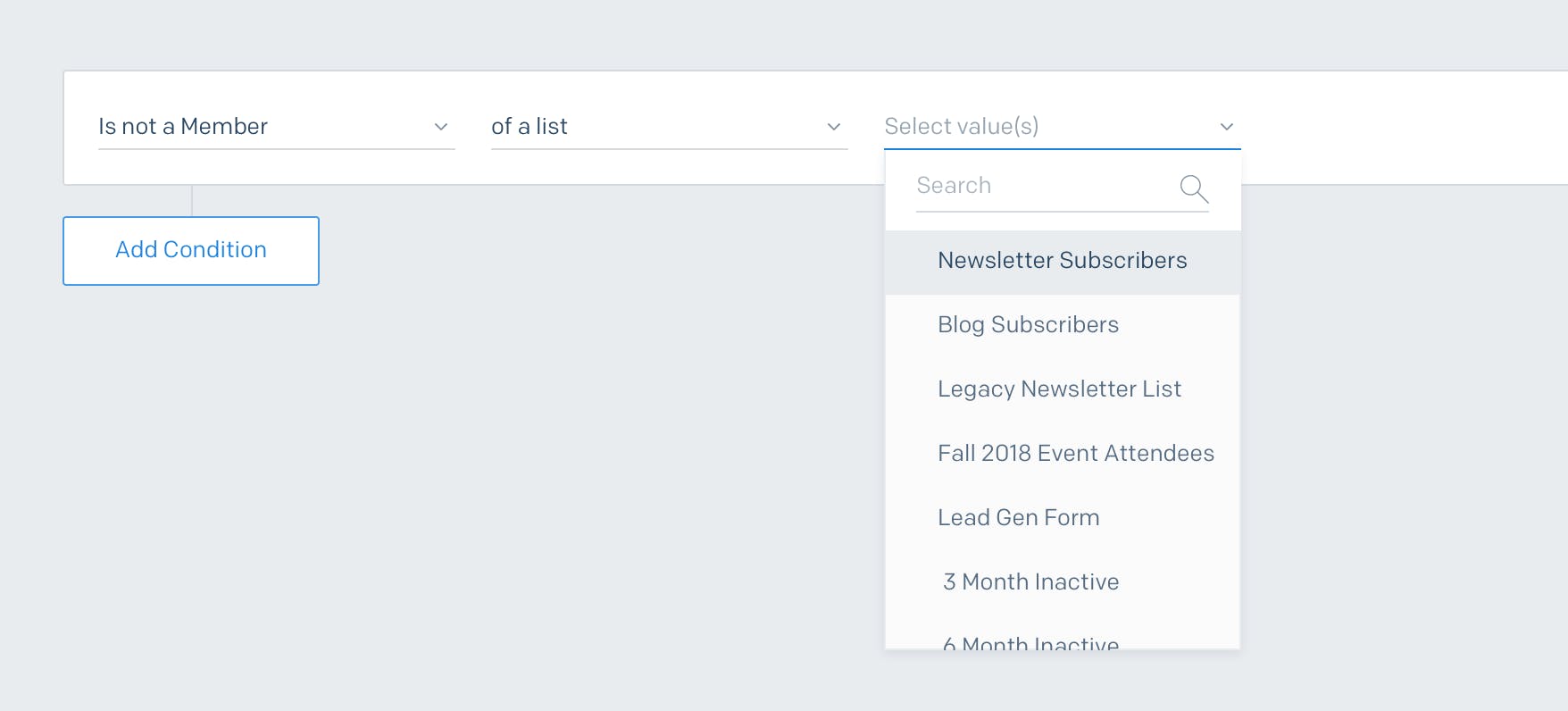
- It was difficult to find a specific field in the long list of event and contact fields in the current select implementation.
- While building a new segment, it was hard for the marketer to know how big or small the segment output would be without saving the segment and viewing the contact count on a different view.
- Returning to a previously created segment and trying to easily understand how the conditions were working together was difficult.
Without the flexibility to create a complex segment, it was difficult for marketers to target the right group of people. As a result, the campaign would be less effective at reaching her intended audience, which is often crucial in driving business goals.
Identify Success Metrics
During this problem discovery phase, I worked with a PM to start identifying success metrics that would tie back to key problem areas, which would allow us to identify if our proposed solutions were solving the problems. Some of these were as follows:
- Decrease in number of Support Tickets related to segmentation.
(would indicate a more intuitive segment building experience) - Increase in the number of conditions included in a single segment.
(would indicate an easier experience to create complex segments) - Increased percentage of segments being used as send groups for Email Campaigns, in place of static lists.
(would indicate an increase in confidence with the segment builder)
Step 2 → Solution Discovery
After identifying the current problems and peeling back the layers with customer interviews to understand the root cause, I was ready to start the design process.
Competitor Research
In order to understand what query builder patterns already existed and how our target users were currently using them, I performed some quick competitor research. To help speed up this process I organized a competitor research jam with my fellow designers, product managers, and product marketing managers. This helped me crowdsource the research and enabled us to discuss the pros and cons of each in a collaborative way. I collected and analyzed all the research, careful to highlight the pros and cons of each solution.
Establish a Shared Terminology
To make sure we were speaking the same language with both the internal teams building this feature, but also for the customers and support team that are experiencing it externally, we established a consistent terminology that described the building blocks of segments.
Establish a Query Language
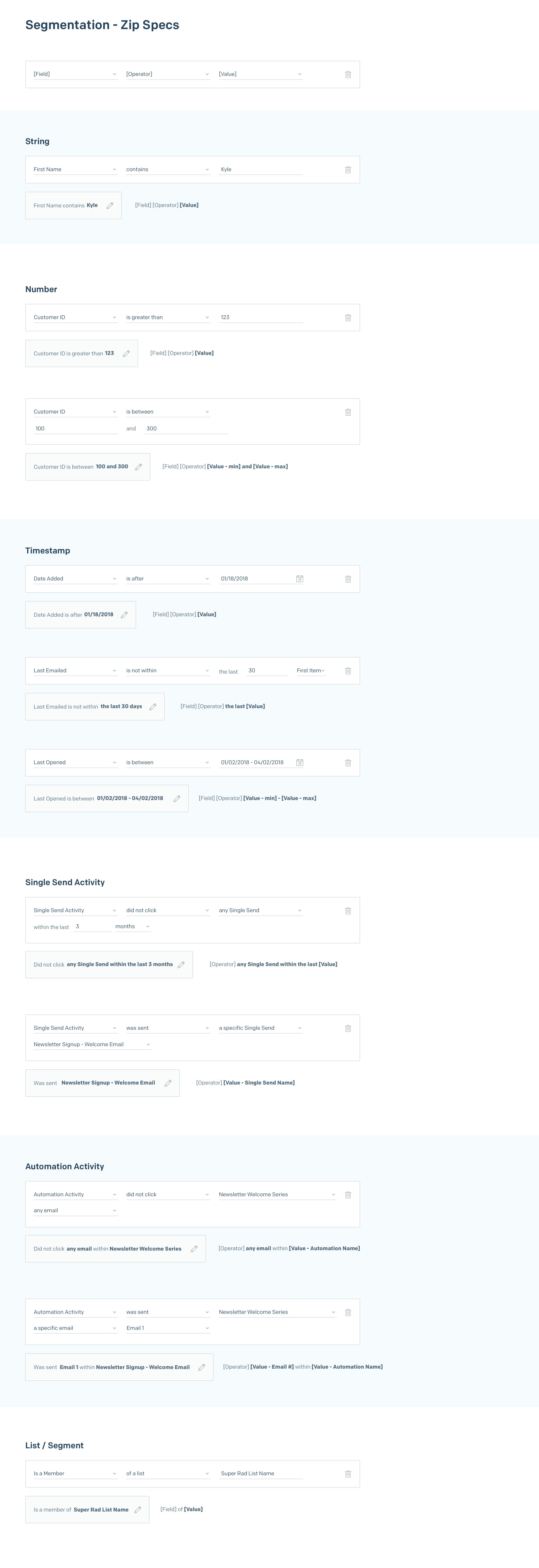
Our new segment language needed to support both marketers building segments via the UI, and developers creating segments via our API. So we decided to focus first on designing the underlying query language itself. I worked closely with our engineering partners to establish an intuitive query language that was informed by the insights we gathered from our initial round of customer interviews. We then validating the proposed language by performing card sorting during further rounds of customer interviews.
Design Ideation (Diverge into multiple ideas)
Once I clearly identified and understood the current problem, I jumped into creating multiple low fidelity wireframes to solve for the pain points we prioritized with customers. I created multiple ideas, seeking feedback from my fellow designers, product manager partner, and support product marketing manager. I chose to use low-fidelity wireframes at this stage to quickly get ideas onto the screen and play with the different interactions without worrying about fitting in with our current pixel-perfect design language. After exploring many different concepts, I consolidated my solutions into 2 different wireframes and created clickable prototypes for each to start getting feedback from internal team members as well as customers.
__
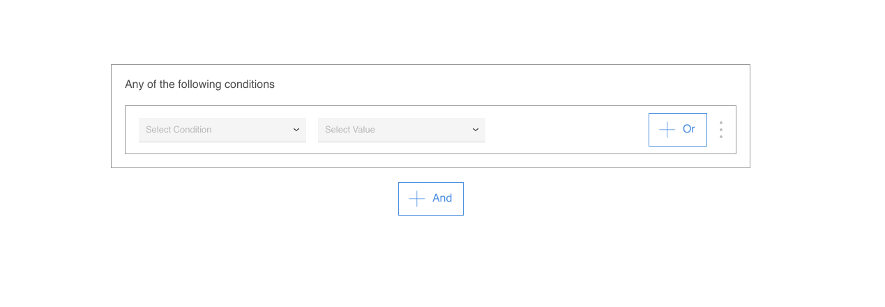
👆Feedback on Version 1 revealed the following:
- ✅Customers found the action to add more conditions with the explicit ‘+ And’ button intuitive.
- ✅Having the outer container indicating that 'Any of the following conditions' helped the customers understand how the combination of conditions would operate. But a little confused on how to change it to 'All...' instead.
- ⛔️Customers were not able to easily switch between the AND / OR connector.
- ⛔️Customers had trouble finding the 3-dot action menu and unsure of what it would reveal.
- ⛔️Customer did not understand the concept of nesting conditions, nor expressed a big need with their current use cases.
__
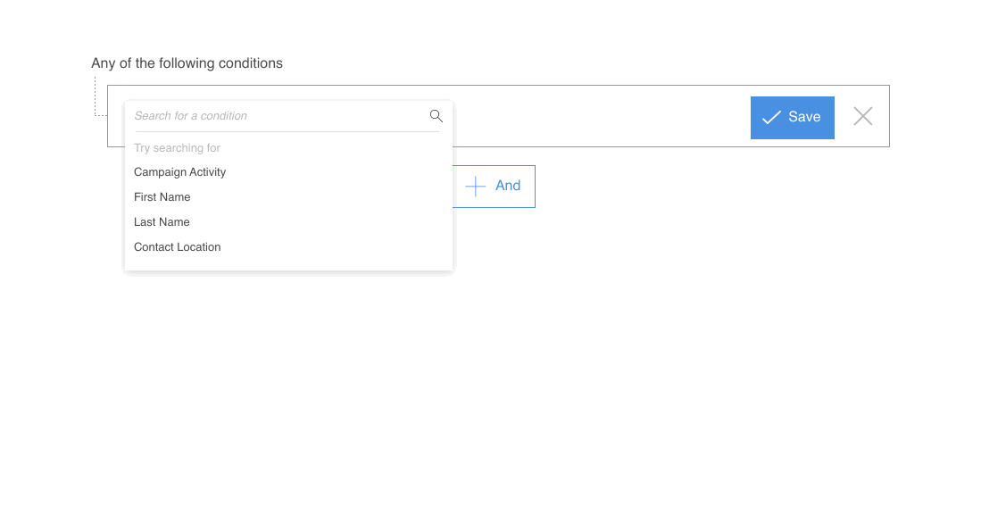
👆Feedback on Version 2 revealed the following:
- ✅Customers found the action to add more conditions with the ‘+ And’ button intuitive.
- ✅Customer enjoyed having the condition specs summarized in a human readable sentence after creating / editing each.
- ⛔️Customers were not able to easily switch between AND / OR connector button.
- ⛔️Customers did not find it easy to ‘zip’ up the condition into a human readable sentence by clicking on the ‘✔ Save‘ button.
- ⛔️Customer did not understand the concept of nesting conditions, nor expressed a big need with their current use cases.
__
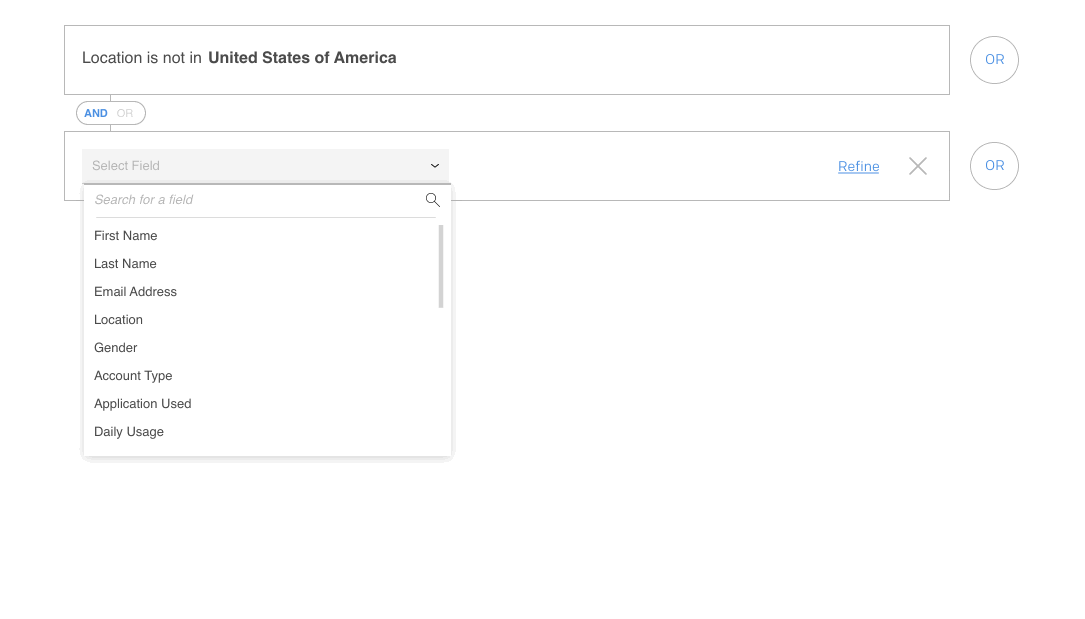
👆Feedback on Version 3 revealed the following:
- ✅Customers were able to easily switch between AND / OR connector with the toggle button.
- ✅Customers liked having the searchable select to choose their condition inputs.
- ✅Having the conditions sandwich together to represent the OR connector
- ⛔️Customers did not find the '➕' action to add more conditions intuitive.
- ⛔️Customers did not find the 'Refine' action to nest conditions intuitive.
Step 3 → Design Refinement
After analyzing the ✅and ⛔️coming out of the wireframe testing, I started refining the design to address the pain points revealed, and combining the positives.
The next step was to verify that our combined solution addressed the paint points we identified during the problem discovery phase. To do this, I created a higher fidelity clickable prototype to use for further testing with customers. The following showcase a few of the specific portions of the designs that addressed some of these key problem areas.
Supporting both AND logic, and OR logic
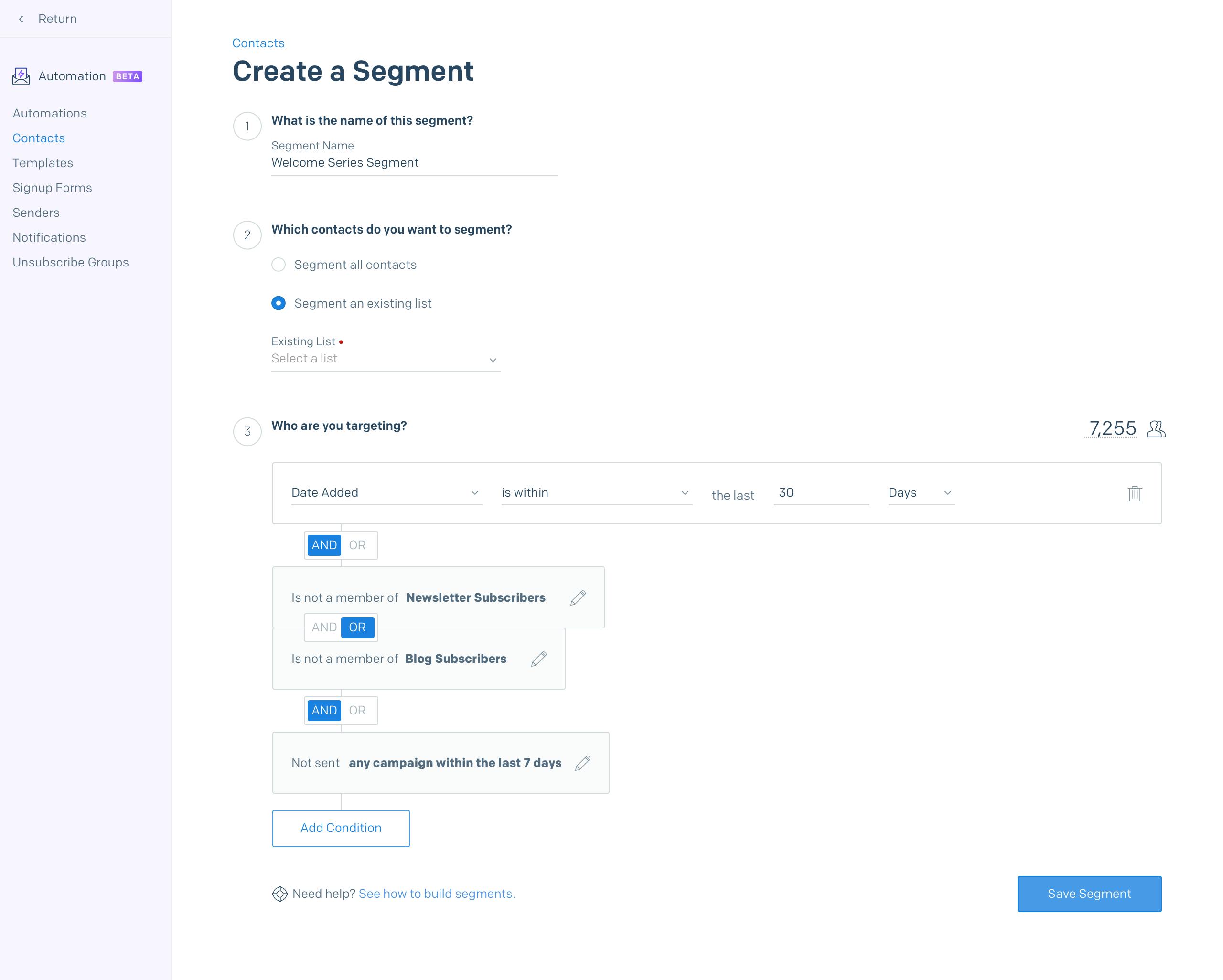
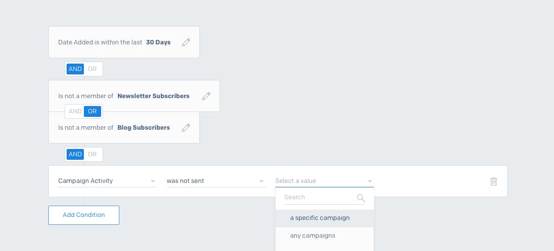
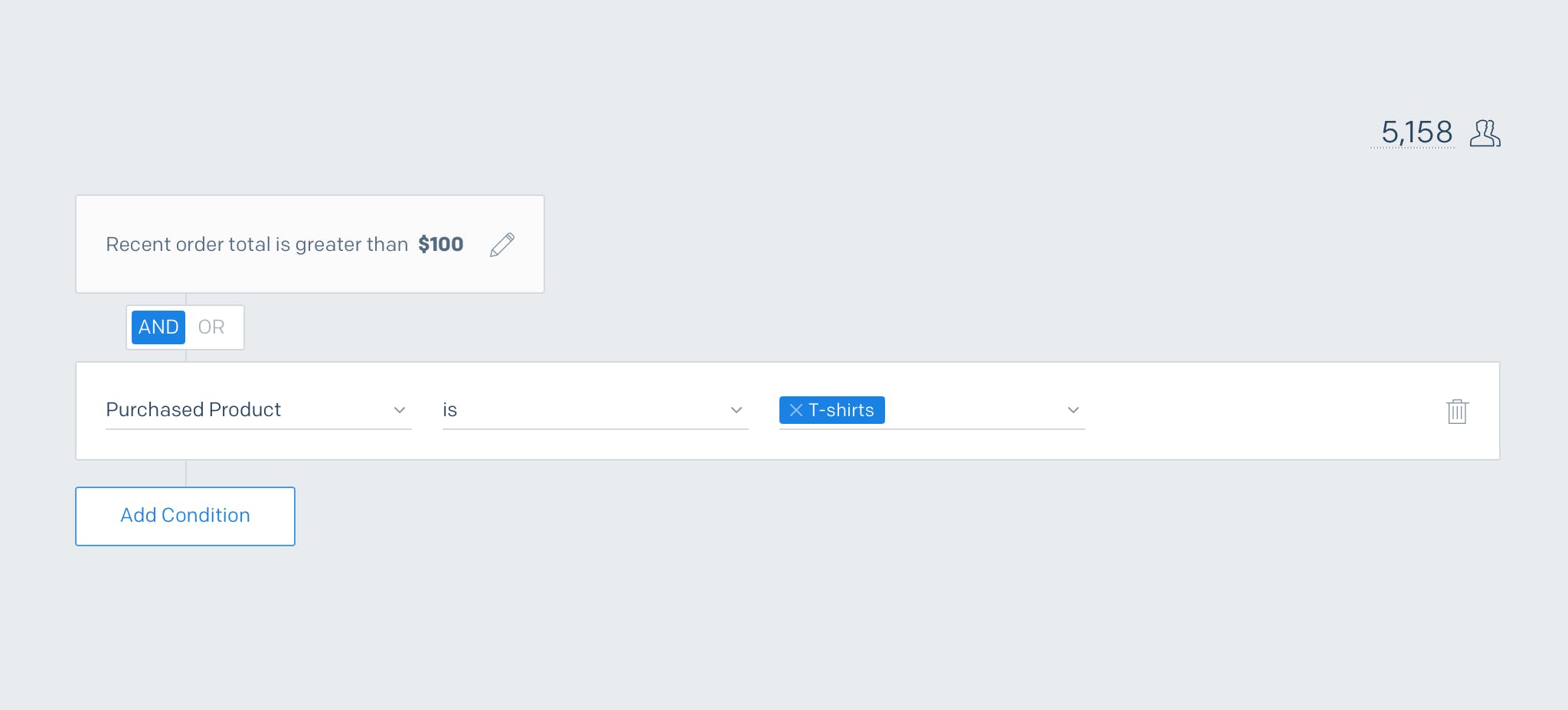
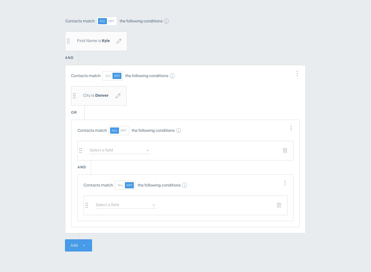
One of the biggest pain points we identified was our previous UI not being able to support both AND and OR connectors between conditions. We used a visual representation of the conditions connected with an OR to help the Marketer easily distinguish those arguments from the AND conditions.
Searchable Fields
We incorporated searchable selects for our Field select and Value select to help our marketer quickly find her desired item when she would typically be choosing from a large list.
Human Readable Conditions
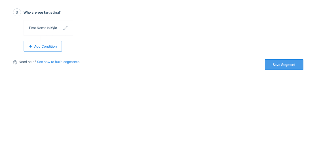
Our sophisticated marketers would typically create segments with containing more than 5 conditions at a time. To reduce the cognitive load of parsing a set of conditions, when the marketers were finished selecting the contents of a condition, we would collapsed the condition into a human readable sentence. This allowed the marketer to quickly review the conditions she had created and feel confident about executing the segment.
Estimated Audience Count
A surprising find during our initial rounds of testing was that our customers were typically going into building a segment with a desired amount of contacts they wanted to be reaching. They would add the conditions they absolutely needed, and then would adjust to fit their desired outcome number. The only way they could do this today, was to add the conditions, save and allow the segment to calculate the contact count. Then edit the segment to add/remove conditions to increase/decrease their audience count. To make this easier we implemented an estimated audience counter that would run after each change made to a. condition. This allowed our customers to remain in the building flow and not jump back and forth from saving and editing the segment.
Thinking about the next phase with Nested Conditions
One limitation that we explored solving for was the ability to nest conditions. Although this wasn't a typical workflow for our marketers, it proved to be a powerful testing tool for our developers that would be creating more complex queries using our SGQL and using the UI for verifying their segments. Although we have not yet built this iteration of the segment builder, you can play around with the prototype we used for user testing here.
In Conclusion
This was an extremely fun project to work on due to the complexity of the underlying query language. Bridging the gap between a powerful query language and a simple to use segmentation builder UI was a challenging but rewarding puzzle to solve!